 “na géill go deo”
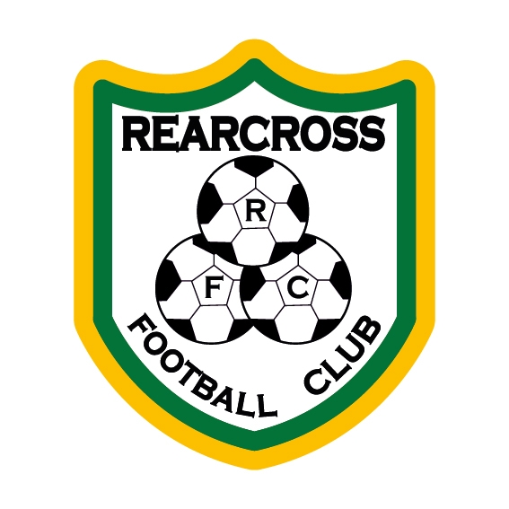
The Club crest my not be the most artistic or imaginative in terms of design but fits the picture in terms of symbolism. The crest was devised using primitive means and is symbolic of the Club’s frugal origins in terms of financial means and also themes that a triplication and overlapping of energy and resources both on and off the field produces a cohesive holistic output. Of course, the Club was very fortunate to inherit such a spirited legacy from the stalwarts who led the way the early years of the Club’s existence.
The early nineties were great times for soccer in Ireland following the exploits of the Irish team at Italia ‘90, so the day dawned at some stage that the Rearcross FC should buck the trend with our own crest, hence there is some linkage and imagery in terms of the football design used in both crests. So, in some respects, the Club crest was somewhat triggered by the Italia ‘90 logo. In an era before advanced design software, it was back to basics. A five-penny piece was placed on a piece of paper and circled with a pencil before ball design to include letters RFC were inserted within to produce the final version.
The Club motto of “na géill go deo” (never give up) was adopted in recent years and is based on the legacy inherited from our founding members who battled against the odds on and off the field to give the Club a sounding footing which has stood the test of time.
Written by Ger Kennedy (July 2016)